G
7.0
Gameplay 30%
Gameplay was not playtested. Default score 7.0. This dimension was not playtested, and the default is what the ranking uses.


Home / Reviews / color-spectrum-mosaic-ordering / I Love Hue
I Love Hue looks relevant to readers who enjoy ordering visual relationships for their own sake. It is less conclusive for someone needing non-color cues or a fully documented comparison metric. Its distinctive idea is spectrum placement, not a verified promise that every surrounding condition is equally gentle.
Opens the official store and leaves this site. Kids: ask a grown-up before buying anything.
I Love Hue makes the color relationship the puzzle rather than using color merely to label matching objects. The developer explicitly frames it as perception-based play, not a conventional logic exercise. This source-based analysis uses the US App Store listing, not hands-on play.
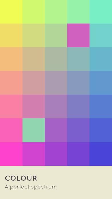
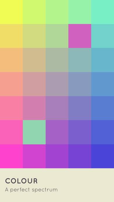
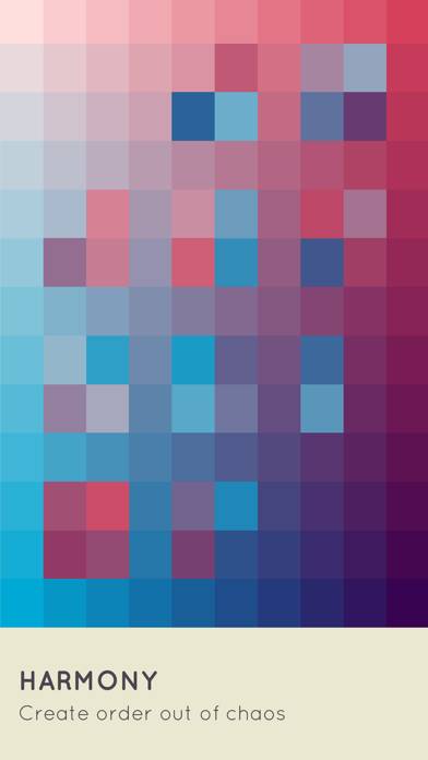
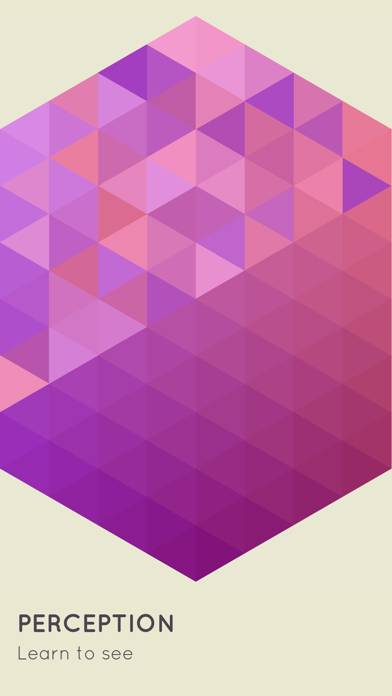
Zut describes moving colored tiles into ordered mosaics. Success means restoring a coherent spectrum, not clearing three equal pieces or completing a word.
As genre-level context, comparing how a shade relates to nearby shades is a different activity from identifying one named color in isolation. The supplied description does not fully explain fixed anchors, the move gesture, or which placements are counted as correct at each stage.
Those omissions should not be filled with a precise control guide or claims about unrestricted movement. The core documented action is arranging color, not a particular interface implementation.
The feature text emphasizes noticing small differences between similar colors. That may appeal to readers who enjoy visual calibration and gradual order rather than a narrative campaign or action sequence.
It also makes color discrimination central to the decision. The source does not document alternate labels, symbols, contrast settings, or accommodations for different color-vision needs. Their absence from the description is not proof they do not exist, but accessibility should not be certified from the serene pitch.
No screenshot was visually inspected. Specific palettes, tile counts, mosaic shapes, and screen density are not independently described.
The developer advertises more than 900 levels, a synth soundtrack, achievements, and comparison against a world average. That comparison offers an additional performance goal beyond simply completing the arrangement.
The description does not define the underlying statistic or how the comparison population is selected. It should not be treated as an independently verified ability test, intelligence measure, or live ranking.
Likewise, tranquility does not establish that there are no timers, paid access conditions, or interruptions.
No customer-review bodies are available in the supplied evidence. There is no supported player consensus about the learning curve, visual comfort, repetition, or value.
The metadata records a free download. Advertising frequency, removal offers, offline operation, and stability are unverified. Promoted calm is not a demonstrated health outcome.
I Love Hue looks relevant to readers who enjoy ordering visual relationships for their own sake. It is less conclusive for someone needing non-color cues or a fully documented comparison metric. Its distinctive idea is spectrum placement, not a verified promise that every surrounding condition is equally gentle.
View the official US App Store listing · How evidence differs from playtesting
No gameplay, ad, purchase, offline, or stability testing performed.
Gameplay was not playtested. Default score 7.0. This dimension was not playtested, and the default is what the ranking uses.
Ads were not playtested, and this game has no separate store-ad sample. The no-forced-ads tag stays unknown. Default score 7.0. This dimension was not playtested, and the default is what the ranking uses.
Whether a purchase is required to keep playing was not playtested. Default score 7.0. This dimension was not playtested, and the default is what the ranking uses.
Content depth was not playtested. Default score 7.0. This dimension was not playtested, and the default is what the ranking uses.
Stability was not playtested. Default score 7.0. This dimension was not playtested, and the default is what the ranking uses.
No. The listing describes arranging tiles into a spectrum.
Yes, explicitly.
No. Its exact calculation is not supplied.
No. Calm language alone does not establish it.